This was one of two final projects for my Information Design course in Spring of 2021.
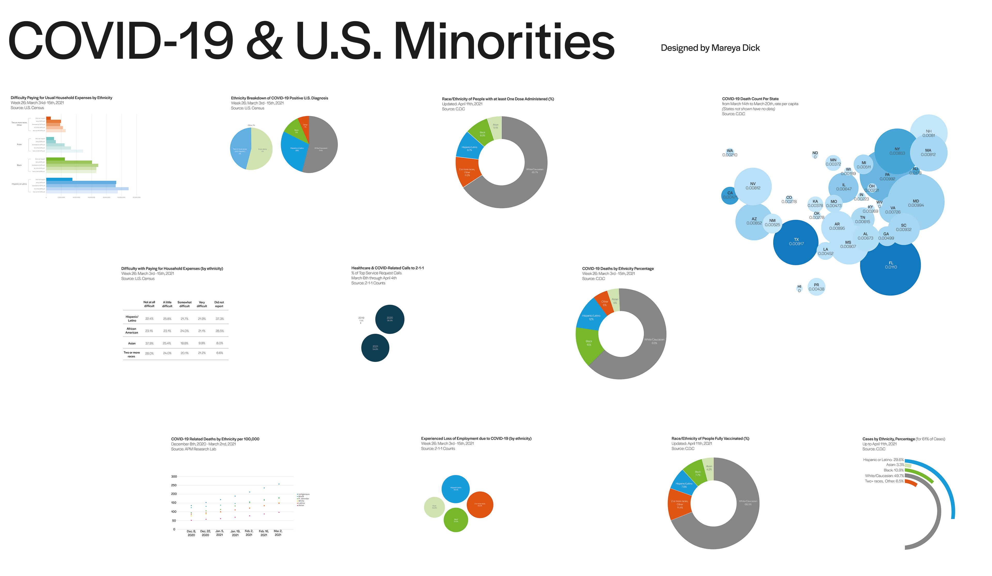
I am not a math-oriented person, and thus knew visualising numbers would be a little bit of a challenge for me. I had initially made more bar charts, but found they went against the increasing amount of circular charts I had.
So, I went off in exploring how many different ways there were in visualising numbers with circles as the main shape.
Once I had all my data set in their visualisations, I found myself in a pickle. Yes, they looked visually pleasing on their own, but how should these lay as a collective spread? I continuously flipped the artboard from horizontal to vertical, back to horizontal. Changed it from horizontal rows, to circular rings; nothing looked right. In the end, I found that horizontal vertical columns looked best in presentation, as shown in the final above.